
In a discussion about top frontend design languages, Material Design by Google is one of the most popular contenders for the favorite spot, but there is a close, maybe lesser-known, competitor, that is Ant Design. With some of the big players in their respective industries like Alibaba, Tencent, Baidu all using Ant Design, let’s explore some of the key features that make Ant Design special compared to others.
What is Ant Design in React?
Ant Design is a React UI library that contains easy-to-use components that are useful for building interactive user interfaces. It is very easy to use as well as integrate. It is one of the smart options to design web applications using React. It provides us with high-quality components which can be used with ease.
Installing Ant Design: We can install it using npm. To install it, first make sure you have installed Node.js and npm.
npm install antd
Let’s understand the working of Ant Design using an example.
Step 1: Create a React application
npx create-react-app foldername
Step 2: Move to your project folder
cd foldername
Step 3: Install Ant Design
npm install antd
Project Structure:
The Design Principles of Ant Design
Ant Design, according to its own design values page, focuses on a user experience that is:
- Natural — a visual interaction that is devoid of complexity and feels natural to use
- Certain — establish design rules such that it avoids low-efficiency & difficult-to-maintain products
- Meaningful — design interfaces keeping the needs of the end-user in mind
- Growing — design interfaces that improve the discoverability of functions and values of the product
Natural

The light-speed iteration of the digital world makes products more complex. However, human consciousness and attention resources are limited. Facing this design contradiction,the pursuit of natural interaction will be the consistent direction of Ant Design.
- Natural user cognition: According to cognitive psychology, about 80% of external information is obtained through visual channels. The most important visual elements in the interface design, including layout, colors, illustrations, icons, etc.
- Natural user behavior: In the interaction with the system, the designer should fully understand the relationship between users, system roles, and task objectives, and also contextually organize system functions and services.
Certain

Interfaces are the medium of interaction between users and the system. They are the means rather than the purpose. Based on the pursuit of "natural" interaction, the product interfaces created by Ant Design should be high certainty and low cooperative entropy.
- Designer certainty: Enterprise products are made by collaboration. The more participants, the higher the entropy of cooperation. This is why low-efficiency design and difficult maintenance of the product system exists. the cooperative entropy
- Keep restraint: Don't make a decision before you figure it out. Designers should focus on the most valuable product features using minimal design elements to express.
- User certainty: User's daily work is completed through the collaboration of enterprise products. In addition to considering the consistency of a single product design.
Meaningful

A product or function is created by a designer not because of the designer's needs, but to carry a user's work mission. Product design should be user-centered to promote the achievement of the user's mission. Simultaneously, based on "nature" and "certainty" design values.
- Meaning of result: Clear goals, immediate feedback. Understand the objectives, clearly disassemble the sub-objectives according to the use process, and let each interaction revolve around the achievement of the main objectives.
- Meaning of process: Moderate challenge, full devotion. Adjust the difficulty of work in different scenarios, make the function trigger at the right time to match the user's skill. If not necessary, do not add entities. Do not distract users, let users focus on task achievement.
Growing

The growth of enterprise product's capabilities is accompanied by the evolution of user system roles. Designers should be responsible for the products they create and improve the discoverability of functions and values.
- Value connection: The growth of products depends on the expansion and deep use of users, while the growth of users depends on the growth of product functions. Designers should establish system design thinking, understand the value of product functions.
- Man-Computer Symbiosis: More connections between product functions and user requirements make human-computer interaction closer and users and system are growing together. When designing products.
Ant Design UI Components
Ant Design is a popular ReactJS UI library that is used to build the design system for enterprise-level products. The Ant Design contains a rich set of high-quality components for building efficient & interactive user interfaces with an enjoyable work experience. Ant design facilitates a huge number of UI components to enrich your web applications.
-
Ant Design General Component
- Ant Design Button Component
- Ant Design icon Component
- Ant Design Typography Component
-
Ant Design Data Entry Component
- Ant Design Form Component
- Ant Design Select Component
- Ant Design DatePicker Component
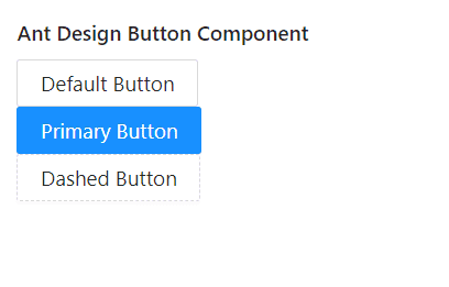
Ant Design Button Component
Button Component provides a way for users to take actions, and make choices, with a single tap. We can use the following approach in ReactJS to use the Ant Design Button Component.
-
In Ant Design we provide 5 types of button.
- Primary button: indicate the main action, one primary button at most in one section.
- Default button: indicate a series of actions without priority.
- Dashed button: used for adding action commonly.
- Text button: used for the most secondary action.
- Link button: used for external links.
Example:
                                  import React from 'react';
                                  import { Button, Space } from 'antd';
                                  const App: React.FC = () => (
                                  <Space wrap>
                                    <Button type="primary">Primary Button</Button>
                                    <Button>Default Button</Button>
                                    <Button type="dashed">Dashed Button</Button>
                                    <Button type="text">Text Button</Button>
                                    <Button type="link">Link Button</Button>
                                  </Space>
                                );
                                export default App;
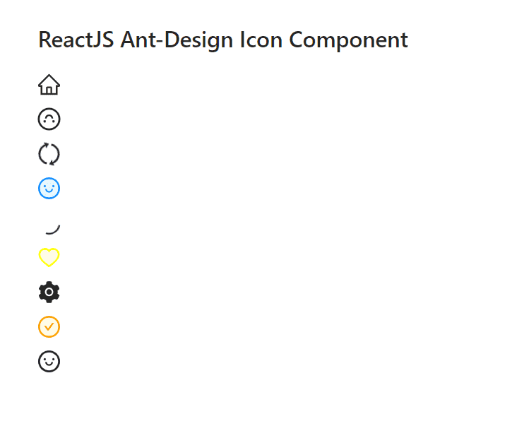
Ant Design icon Component
Icon Component are very useful as Icons are required for every application for UI purposes. We can use the following approach in ReactJS to use the Ant Design Icon Component.
-
Custom Icon Props:
- component:It is used to denote the component which is used for the root node.
- rotate: It is used to rotate the icon by n degrees.
- spin: It is used to rotate the icon with animation.
- style: It is used to pass the style props to the icon like size, border, etc
Example
              import React from 'react';
              import {HomeOutlined,LoadingOutlined,SettingFilled } from '@ant-design/icons';
              import{ Space } from 'antd';
              const App: React.FC = () => (
              <Space>
              <HomeOutlined>,
              <LoadingOutlined>,
              <SettingFilled>,
              </Space>
            );
            export default App;
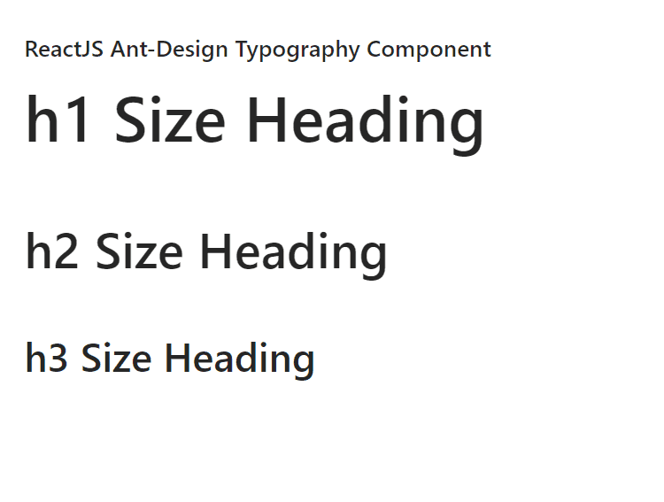
Ant Design Typography Component
Typography component is useful for basic text writing, body text, including headings, lists, and many more. We can use the following approach in ReactJS to use the Ant Design Typography Component.
-
Typography.Text Props:
- code:It is used for the code style.
- copyable:It is used to indicate whether to be copyable or not.
- delete: It is used for the deleted line style.
- disabled: It is used to disable the content.
Example
              import React from 'react';
              import{ Typography} from 'antd';
              const  { Title } = Typography;
              const App: React.FC = () => (
              <Space>
              <Title>h1 Size Heading</Title>
              <Title>h2 Size Heading</Title>
              <Title>h3 Size Heading</Title>
              </Space>
            );
            export default App;
Ant Design Form Component
Form Component is used when the user needs to create an instance or collect information. We can use the following approach in ReactJS to use the Ant Design Form Component.
-
Form Props:
- colon: It is used to configure the default value of colon for Form.Item.
- component: It is used to set the Form rendering element.
- fields: It is used to denote the control of form fields through state management.
- form:It is used to denote the form control instance created by Form.useForm().
Example
              import React from 'react';
              import{ Button, Checkbox, Form, Input } from 'antd';
              const App: React.FC = () => (
              return (
              <Form
                name="basic"
                labelCol={{ span: 8 }}
                wrapperCol={{ span: 16 }}
                initialValues={{ remember: true }}
                onFinish={onFinish}
                onFinishFailed={onFinishFailed}
                autoComplete="off"
              >
                <Form.Item
                  label="Username"
                  name="username"
                  rules={[{ required: true, message: 'Please input your username!' }]}
                >
                  <Input />
                </Form.Item>

                <Form.Item
                  label="Password"
                  name="password"
                  rules={[{ required: true, message: 'Please input your password!' }]}
                >
                  <Input.Password />
                </Form.Item>

                <Form.Item name="remember" valuePropName="checked" wrapperCol={{ offset: 8, span: 16 }}>
                  <Checkbox>Remember me</Checkbox>
                </Form.Item>

                <Form.Item wrapperCol={{ offset: 8, span: 16 }}>
                  <Button type="primary" htmlType="submit">
                    Submit
                  </Button>
                </Form.Item>
              </Form>
            );
          };

          export default App;
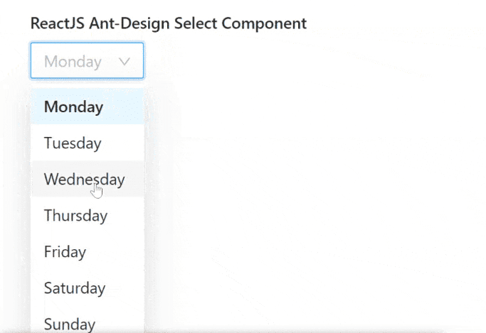
Ant Design Select Component
Select Component is used to select a value from options. It is used to collecting user-provided information from a list of options. We can use the following approach in ReactJS to use the Ant Design Select Component.
-
Select Props:
- allowClear: It is used to indicate whether to Show a clear button or not.
- autoClearSearchValue: It is used to indicate whether the current search will be cleared on selecting an item or not.
- autoFocus: It is used to get focus by default.
- bordered: It is used to indicate whether it has border style or not.
Example
              import React from 'react';
              import{ Select} from 'antd';
              const handleChange = (value: string) => {
                 console.log(`selected ${value}`);
               };

               const App: React.FC = () => (
                 <>
                   <Select
                     defaultValue="lucy"
                     style={{ width: 120 }}
                     onChange={handleChange}
                     options={[
                       {
                         value: 'jack',
                         label: 'Jack',
                       },
                       {
                         value: 'lucy',
                         label: 'Lucy',
                       },
                       {
                         value: 'disabled',
                         disabled: true,
                         label: 'Disabled',
                       },
                       {
                         value: 'Yiminghe',
                         label: 'yiminghe',
                       },
                     ]}
                   />
                   <Select
                     defaultValue="lucy"
                     style={{ width: 120 }}
                     disabled
                     options={[
                       {
                         value: 'lucy',
                         label: 'Lucy',
                       },
                     ]}
                   />
                   <Select
                     defaultValue="lucy"
                     style={{ width: 120 }}
                     loading
                     options={[
                       {
                         value: 'lucy',
                         label: 'Lucy',
                       },
                     ]}
                   />
                   <Select
                     defaultValue="lucy"
                     style={{ width: 120 }}
                     allowClear
                     options={[
                       {
                         value: 'lucy',
                         label: 'Lucy',
                       },
                     ]}
                   />
                 </>
               );

               export default App;
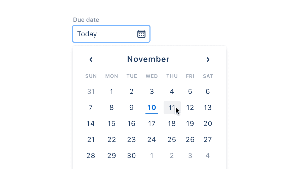
Ant Design DatePicker Component
DatePicker Component is used to select a date from a popup panel when the user clicks on the input box. We can use the following approach in ReactJS to use the Ant Design DatePicker Component.
-
DatePicker Props:
- defaultPickerValue: It is used to set the default picker date.
- defaultValue:If start time or end time is null or undefined, it is used to set the default date.
- disabledTime: It is used to specify the time that cannot be selected.
- renderExtraFooter: It is used to render extra footer in the panel.
Example
                 import React from 'react';
                 import type { DatePickerProps } from 'antd';
                 import { DatePicker, Space } from 'antd';
                 const onChange: DatePickerProps['onChange'] = (date, dateString) => {
                 console.log(date, dateString);
                 };
                 const App: React.FC = () => (
                      <Space direction="vertical">
                        <DatePicker onChange={onChange} />
                        <DatePicker onChange={onChange} picker="week" />
                        <DatePicker onChange={onChange} picker="month" />
                        <DatePicker onChange={onChange} picker="quarter" />
                        <DatePicker onChange={onChange} picker="year" />
                      </Space>
                    );
                    export default App;
Conclusion
With a fluid, responsive UI, clean design language, and also visualization support through AntV, Ant Design is surely on the way to grab a huge chunk of the market share when it comes to Industry grade dashboards. Given the extensive list of components, features, and customizations provided by Ant Design, it counts as a worthy candidate when it comes to the selection of your next frontend design framework.
Read more blogs here